ARTWORK FILE SET UP
Artwork for printing needs to be supplied as vector artwork with all text converted to outlines, 3mm bleed and crop marks should be present. Usually this will be supplied as a pdf file. Artwork should be CMYK for standard printing or Pantone spot colours for custom spot printing. If you are unsure of any of these descriptions please scroll down, detailed explanations are given below.
Supply as PDF l Vector Artwork l 3mm Bleed l Crop Marks
CMYK Colour Space l Text converted to Outlines
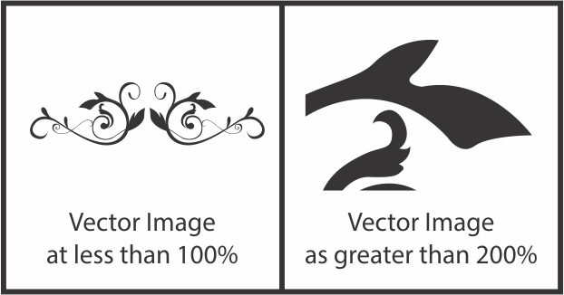
WHAT IS VECTOR ARTWORK?
When you create artwork on a computer there are two major graphic types of files that you can use. The first is bitmaps and the second is vector.
Vector files are made up of lines plotted on a grid. Each item is essentially a line with a colour fill and an outline. These can be placed together to make complex designs with hundreds or thousands of elements. Vector artwork does not have a resolution and can be scaled as large as you like without getting blurry like a bitmap. Vector files are also often smaller in file size.
Vector files are best for illustrations, drawings and text. They are created in programmes such as Adobe Illustrator, Adobe InDesign, Corel Draw, and Inkscape. Common vector based file formats are AI (Adobe Illustrator), CDR (CorelDRAW), SVG (scalable vector graphics), EPS and WMF.
Vector files can be adjusted easily as items can be selected and colours changed with one click. Text can be edited and moved, etc. For this reason vector artwork is the better format for graphic design.
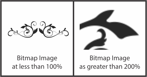
WHAT IS BITMAP ARTWORK?
When you create artwork on a computer there are two major graphic types of files that you can use. The first is bitmaps and the second is vector.
Bitmaps are made up of many dots or pixels. Each pixel is recorded as a colour and a location. Any bitmap file has a set number of pixels in it and the number of pixels and the resolution (how many pixels per inch) determines how ‘large’ the file is. Bitmap images get blurry when you print them too large or zoom in really close on your computer screen.
Bitmap files are best for photos and are created in programmes such as Photoshop, MS Paint, Gimp and Corel Photo. Common bitmap-based formats are JPEG, GIF, TIFF, PNG, PICT, and BMP
Bitmap files can be adjusted broadly with minor adjustments such as brighten but are not easily edited – it is not possible to change wording of text or the colour of an object if the file is a bitmap. As a result bitmaps are not recommended for graphic design.
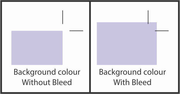
WHAT IS BLEED?
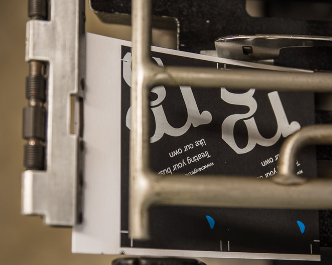
Bleed is applicable when your printed design goes right to the edge of your item. An example of this might be a coloured background that covers the whole of your business card. When the print goes all the way to the edge like this you need it to go past the edge in the artwork. This is called bleed.
When we request 3mm bleed this means the design needs to go past the edge of the item by 3mm. This allows for some variance in the printing and in the trimming without ending up with thin white lines on some of the edges where the print or trim might be off by fractions of a millimeter.
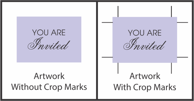
WHAT ARE CROP MARKS?
Crop marks should be visible on all artwork. This shows the edge of the item. These are used by the person operating the guillotine to know where to trim in order for your print to be in the right place on the card.
Crop marks can easily be added when you export your file to a pdf. Usually is it an option you can choose along with several other add ons such as desensitometer marks and colour bars.
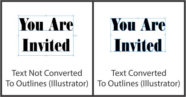
WHY CONVERT TEXT TO OUTLINES?
When creating artwork in a graphics programme you use a font which is installed on your PC or Mac to type the text, resize it, get the spacing right etc, etc.
When you create your pdf and send it to someone else (e.g. a printer) we may not have the same font you used when you created your design. When we import your artwork the text can change as a result. Sometimes the difference is subtle like spacing changing slightly and sometimes it can change the font entirely. While we are always cautious to look for these possible changes sometimes we can miss them.
There is a fool proof way to avoid this happening. You can convert all of your text to outlines before you export it to a pdf. The artwork should still look the same but now the computer sees the text as shapes or objects rather than as a font. Now when we use your file it does not matter if we have the font in our system – it is not needed. the file is simply a whole bunch of ‘shapes’ on a page.
WHAT IS COLOUR SPACE?
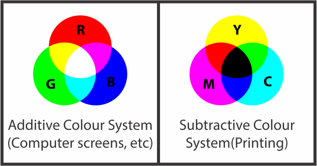
Colour space is the way colour is created. There are two colour spaces, these are defined by nature.
The first is colour space is additive colour. This is the colour of light. There are three primary colours in this system – red, green and blue. When all three colours are added together you get white. All screens such as your computer or TV use this system to create colour.
The second colour space is subtractive colour. This is the colour of objects. When we print we use this system. The primary colours (four colour process) of this system are Cyan, Magenta, Yellow and Black. When we print in full colour we use these primary colours to make the colour you want (i.e. yellow and magenta mix to give us red).
This is important for printing. If you supply artwork in RGB colours to us the artwork will look great on your computer (which uses RGB) but when we print the colours have to be changed over to CMYK and the result will likely be duller and darker than you were expecting. If you design in CMYK it is much more likely that your printed result will be closer to the design you see on your computer.
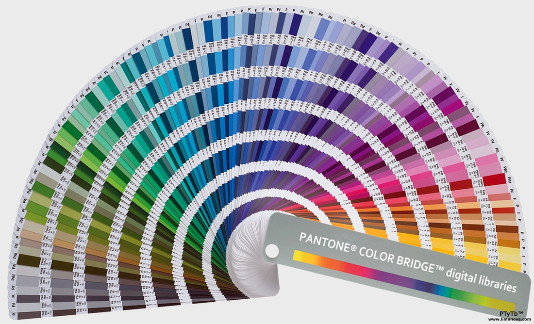
WHAT IS THE PANTONE MATCHING SYSTEM?
The pantone matching system (or PMS for short) is a system designed for the print industry to give consistent results and a much wider range of colours than is achieveable with a four colour CMYK print.
The pantone system only applies to offset and letterpress processes.
It has 18 base colours that can be mixed to create millions of colours from the palest pastel through to bright neons and even some metallic colours. Printers use a pantone guide book that tells us the ‘recipe’ for the colour you require and we mix the ink by hand before putting it on the press.
The advantage of the PMS system is that you can get a much wider range of colours and more consistent results over time. The disadvantage is that it is often more expensive than using CMYK due to the ink being custom mixed and needing to be removed from the press after each run.