LETTERPRESS AND DEBOSS ART PRINT
Letterpress is an art that has been around for centuries, and despite the introduction of digital print technology, letterpress has retained its popularity. Rich and textured, letterpress and debossing has the potential to elevate any design, producing something that is not just seen, but experienced through touch. Beautiful to look at, and memorable to hold, letterpress printing and a blind deboss has a timeless quality – something that no digital printing can come close to.
Still calling on traditional techniques and machinery, letterpress and debossing remains a skilful craft, requiring hands-on attention to detail and careful execution.
THE PRINT YOU HAVE IN YOUR HAND WAS A LABOUR OF LOVE
We envisaged a set of prints that would not only serve as pieces of art to be enjoyed and appreciated, but that could be used by you, artists and creators, to inspire your own designs. They are tools to spark creativity in your own work, and to help you imagine just what’s possible in bringing your visions to life.
ART BY DESIGN
In collaboration with Popgun Creative, we wanted to create pieces that showcased the various printing techniques we call on at Laserfoil. This piece showcases the embellishments we’re able to produce to add extra interest and elevate the appeal of your designs. To ensure that the letterpress and debossed elements really took the limelight, we kept this design clean and precise, with just the use of two colours against a white background. With the overlapping of inks, we were able to introduce new colours for contrast.


A CLEVER COLOUR COMBO
We spent some time with the Pantone swatch book, playing with the colours as they printed to see what would work best for our design. We settled on the combination of orange and a pastel green, which paired nicely with the Colorplan white frost and park green paper stock.
As with the other designs we created the different file separations – one for the orange, one for the green and one for the blind deboss. For the orange and green plates we went with polymer raised plates – the best option for inks. For the blind deboss we went with a magnesium etched block – the harder magnesium allows us to hit the sheet harder and get a more pronounced indent.
FIRST IMPRESSIONS
The first pass was the orange. We used our Pantone formula guide to hand mix the ink from the recipe using a combination of the 18 base colours that comprise the Pantone colour system. Getting the colour mixed correctly is just the start – when running letterpress we need to constantly monitor the print and adjust the ink levels as we go. As the ink gets used the prints start to get lighter in colour – that’s the time to add more ink to the press. If there is too much ink the colour can be too dark and edges can become less defined as the ink bleeds into the white paper, keeping the ink levels consistent is a key aspect of the job!
After the orange ink pass we washed up the press and hand mixed the pastel green colour, changed out the printing plate and moved onto printing the second pass. It was important to get the alignment of this second print very accurate. With certain elements like the dots around the arrow or the key line border of the word ‘edge’ even a slight misalignment would be very noticeable.

MAKING A MARK
The next step, once the inks were dry, was to do the blind deboss. We ran this on the larger 13 x 18 inch press as this gives us greater pressure to hit the sheet really hard and get a really obvious indent. The other trick we used when doing the blind deboss was to use very soft packing underneath the print so the indent really pressed through and out the other side of the paper. This would normally be something we would avoid but as we were duplex gluing side two onto the reverse we were able to cover this show-through effect on the final product.
With the blind deboss complete, we then digitally printed the reverse of the card and moved onto gluing. As the design is linear and also very close to the edge the gluing also needed to be very precise so that when we trimmed the prints out on the guillotine the borders remained consistent and square on all sides.
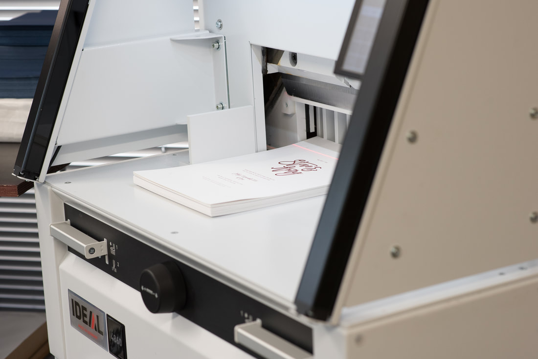
GIVING THEM THE EDGE
With the gluing complete we then trimmed the prints out in stacks. As we were adding an edge colour, it was important we trimmed with a sharp blade. After trimming, the stacks were clamped carefully in their stacks between two thick pieces of plywood. From there, we spray painted the edges one stack at a time. We are careful to apply thin coats of the spray paint so each stack had between 4 and 5 coats applied before the colour was looking good.
PACKAGING UP THE PRINTS
The last step was to make a stylish envelope to present our final prints! We are really proud of the finished result. As you can see, to execute prints that become not just a visual piece of art, but something that can be really experienced, takes skill, precision and patience. Much more than just a promotional piece, we hope these prints help inspire ideas and creative potential for you and your clients, giving you both a tangible reference as you bring your visions to life.


